Design Tokens and Constraint Based Design
This post is based on a presentation I gave while in-batch at the Recurse Center
We tend to take it for granted that when visually styling things on the web, we can make anything any size or colour we like. CSS gives us fine grained control over borders, shadows, animations, accepting arbitrary values measured in many different units including pixels, centimetres, typographic points, average character widths, rem, viewport units, degrees, hertz etc. us fine grained control over borders, shadows, animations, accepting arbitrary values measured in many different units including pixels, centimetres, typographic points, average character widths, rem, viewport units, degrees, hertz etc.
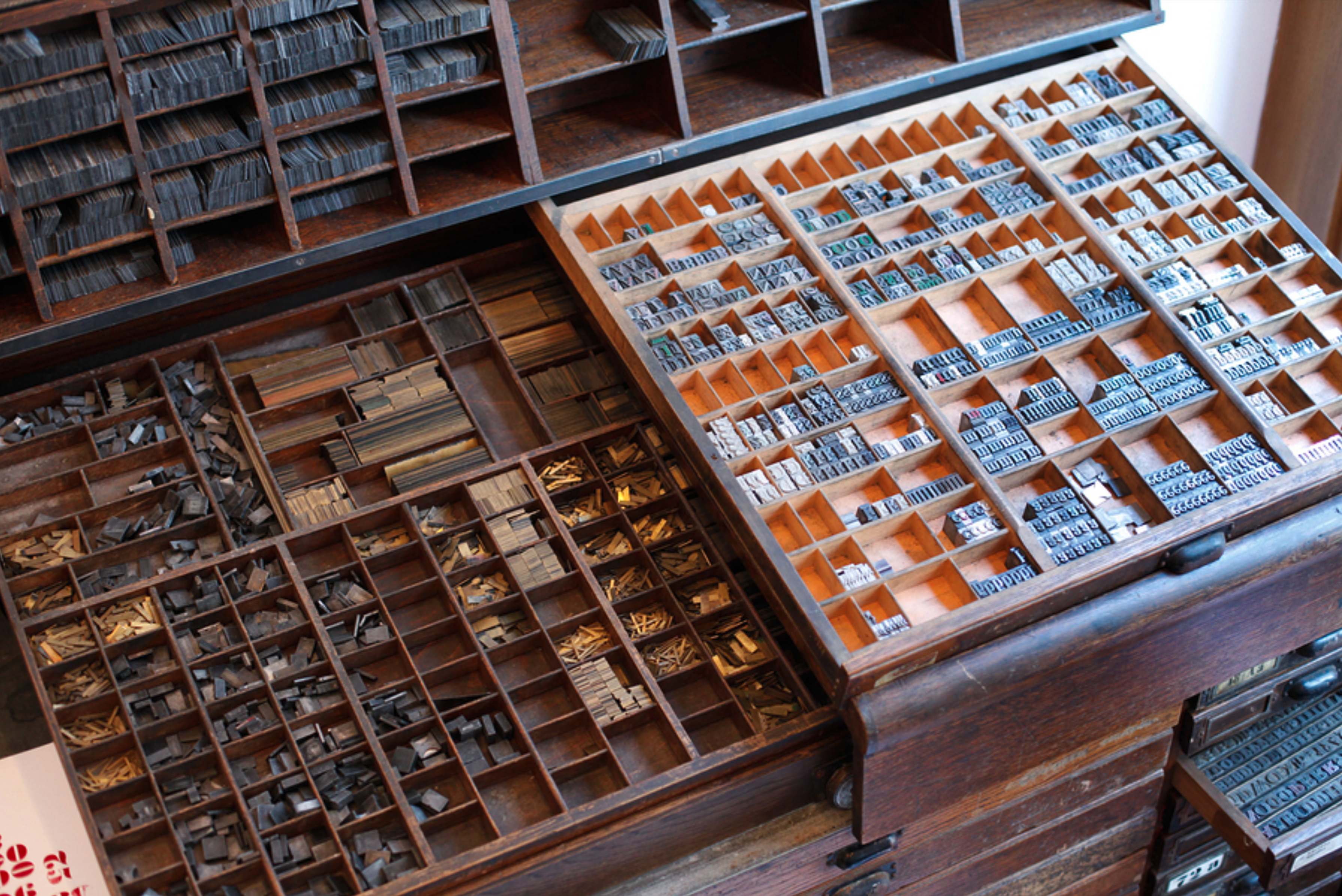
If we consider the history of the printing press, we can appreciate that mass reproduction of visual media did not always have this privilege. To look specifically at font sizes, the manufacturers of printing presses needed to select a set of specific sizes for printing text. This set of sizes was refined over the centuries, and a lot of thought was put into it. We call this set of font sizes a typographic scale. This is the most popular, classic scale. We can recognise it from Microsoft Word.
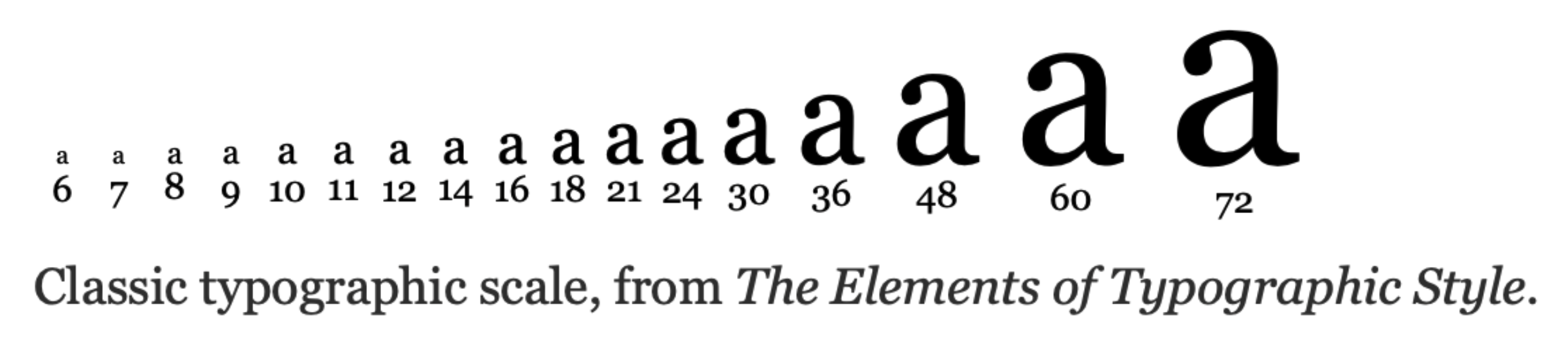
https://spencermortensen.com/articles/typographic-scale/
It’s a scale in the same way that there are scales in music. In Western music, the diatonic scale has seven notes repeated over octaves, and the frequency of any given note is exactly double the frequency of a note one octave below it, and half the frequency of a note an octave above. Here we can see this scaling property with the font size doubling, creating octaves, with 4 notes in between. One alternative type scales are based on the golden ratio. The point is that people have put a lot of thought into it with the goal of creating visual harmony.
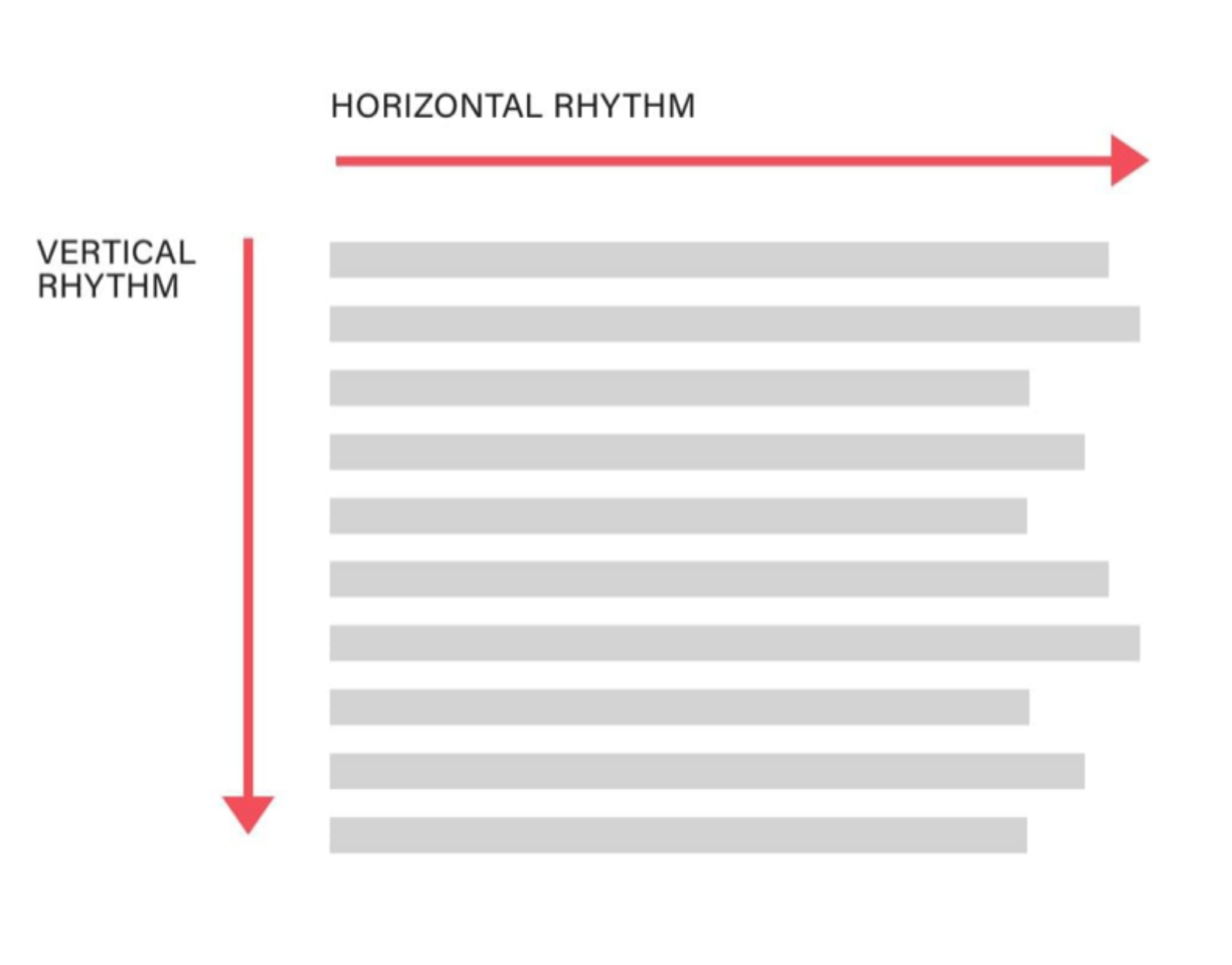
Another useful musical metaphor is typographic rhythm. This is about letter spacing & kerning on the horizontal axis, and line height and paragraph spacing on the vertical axis.
https://betterwebtype.com/articles/2018/10/15/rhythm-in-web-typography/
On the vertical axis, there is an argument that developing a good sense of rhythm involves using a consistent base unit for spacing and expressing all spacing on the page as multiples of that base unit. This image is using the line height of body text.
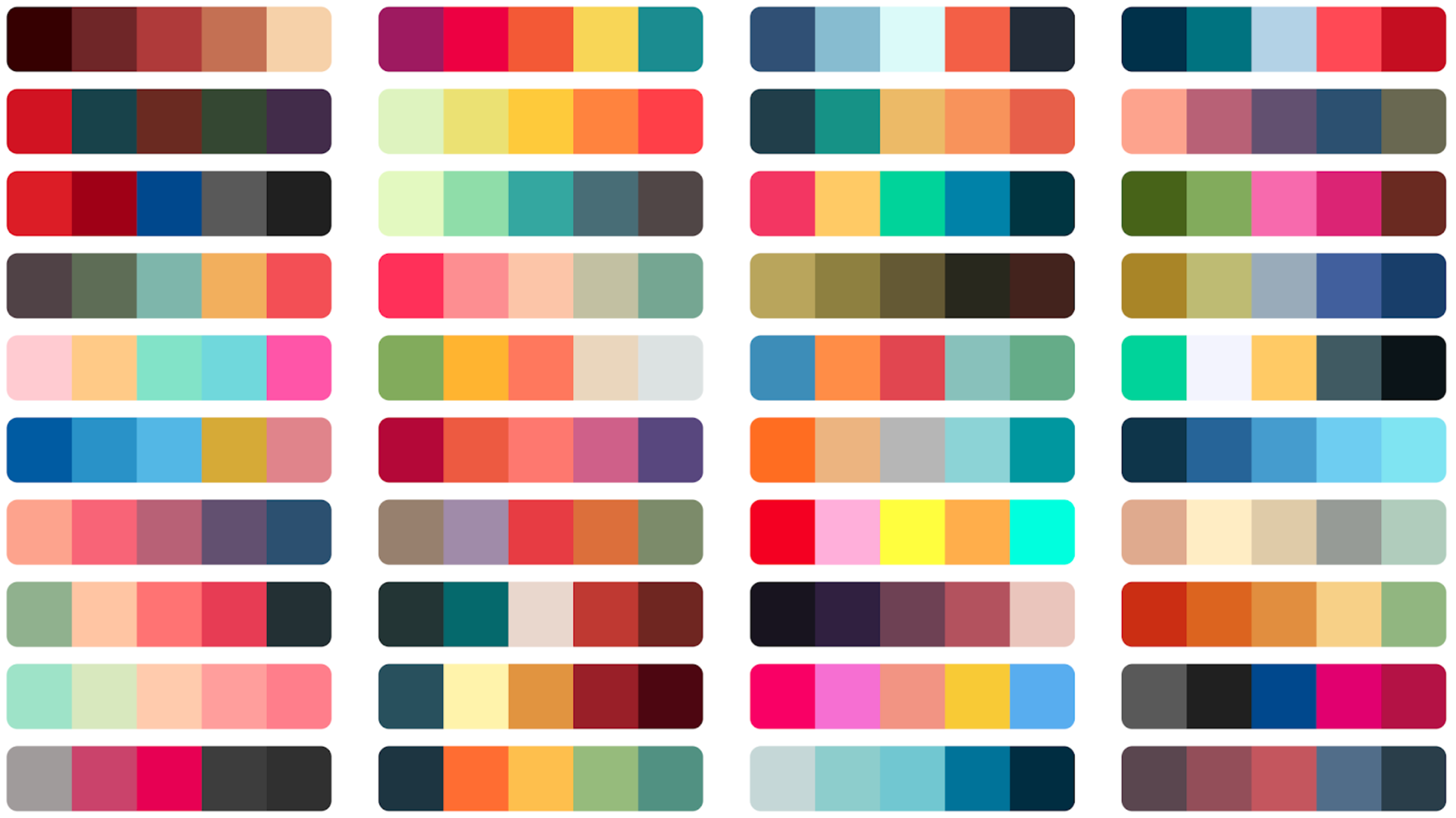
When it comes to colour, I’m sure everyone is familiar with the concept of colour palettes. I think the thing to understand about all of these examples is that a lot of effective design is about constraints. If design is about using visual elements to support the reader in understanding and making meaning, then having fewer design choices makes every choice more meaningful. Moreover, it enables consistency across an entire experience. Users encountering a new visual concept have to do unconscious work to understand it. The greater consistency, the less work they have to do to make sense of the content.
Once I understood this, I wanted a way to use these principles while creating visual layouts for web projects I was working on. Particularly, I'm interested in the constraints whereby arbitrary values are reduced to a limited set of choices. One name for those constraints is design tokens.
See https://css-tricks.com/what-are-design-tokens/
This is the W3C Design Tokens Community Group’s definition of design tokens:
“The single source of truth to name and store a design decision, distributed so teams can use it across design tools and coding languages”
https://www.designtokens.org
https://jxnblk.com/blog/design-graph/
See also https://bradfrost.com/blog/post/atomic-web-design/
https://styled-system.com
See also https://varun.ca/styled-system-revisited/
https://tailwindcss.com
https://stitches.dev